Responsive Design Basics
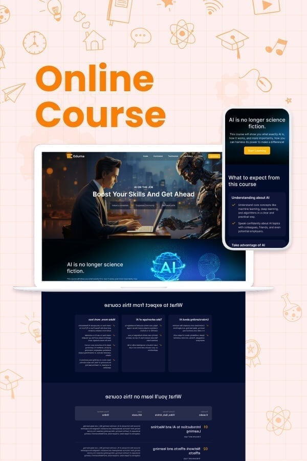
Responsive design is an approach to web design that ensures a website looks and functions well on all screen sizes, from smartphones and tablets to laptops and desktop computers. Instead of creating separate websites for different devices, a responsive website uses flexible layouts, images, and CSS media queries to automatically adapt its content based on the user’s screen size and orientation.
Responsive design improves usability, accessibility, and performance while providing a consistent experience across devices. It is also an important factor for search engine optimization (SEO), as search engines prioritize mobile-friendly websites.
In this lesson, you will learn the core principles of responsive design, including fluid layouts, flexible media, breakpoints, and media queries, and how to build websites that deliver an optimal viewing experience on any device.
Let’s Build Your Design Career Together
Join thousands of learners who are building valuable design skills and launching successful careers in UX.
About Us
Eduma helps learners build practical digital skills through high-quality online courses, expert instructors, and flexible learning experiences.
Links
Useful Links
Contact Us
Follow Us